Kathy from Justuno
15 minute read
Email pop-ups are a conversion marketing necessity. This lead capture tactic is incredibly effective for website traffic conversion, visitor engagement, and product education.
So the question is no longer “Should I use an email pop-up or sms pop up?” But “How do I get the best results out of my email pop ups?”
One simple way to convert more traffic through email popups is through design. Design often means the difference between a quick exit and a visitor taking the time to enter their email address. Here’s a short checklist of design aspects to consider when creating an email pop-up.
- Marketing Copy: Show personality, spur action, and create need/urgency
- Imagery: Visually grab attention, showcase products, or services
- Branding: Match the pop-up to website design and company branding
- CTA (Call to Action): Engaging button copy and button color
- Value Proposition: Why should someone enter their email? This lead magnet could be an incentive promotion, or simply how your newsletter is valuable to them.
Below, we’ve provided a list of 39 email pop up designs, along with a few specific characteristics that have led to superior email capture results.
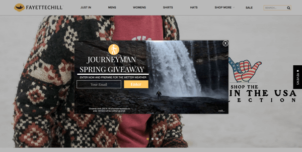
1. Email Capture Pop-Up by Mountain Standard
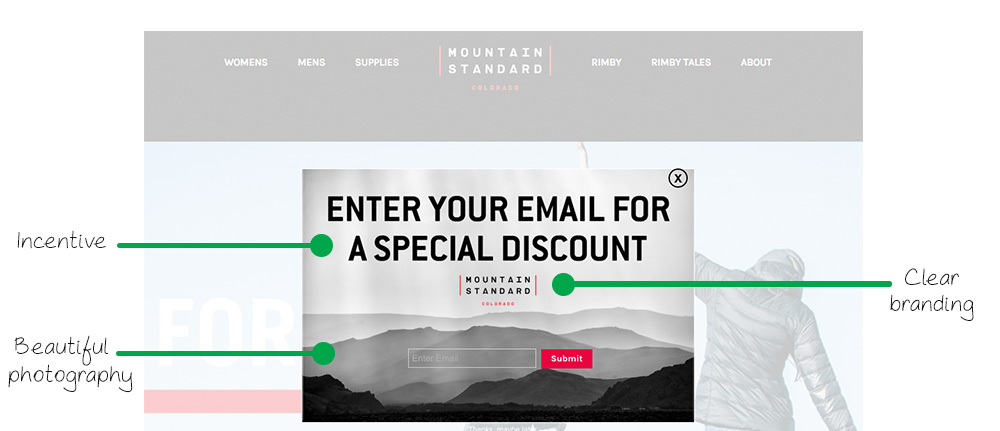
Marketing Copy/Incentive: In most cases, straightforward copy tends to work the best. The headline boldly grabs a visitor’s attention and tells exactly what action must be taken to receive the value, in this case, a discount. This is a great example of marketing copy to start with. You know it’s going to work. If you feel like getting a bit more creative, you can adjust the copy and A/B test it against the original.
Clear Branding: On the popup, Mountain Standard uses the same color scheme as their website and also includes their logo. This gives the pop-up a clean and consistent look that represents the brand effectively.
Beautiful Photography: A black and white landscape of a hazy mountain range, now isn’t that pleasant? Not only is this a spectacular background image, but also appeals to Mountain Standard’s ideal customer, the outdoor enthusiast.
2. Contest Pop-Up by Karmaloop
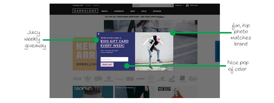
Giveaway Incentive: Want to grab a new visitor’s email? Then run a contest! This is an extremely engaging promotion, and visitors are highly likely to submit an email to receive significant value. Karmaloop runs a weekly gift card giveaway to drive email list growth.
Photography aligned with the brand: Lifestyle and product photos that represent your brand are a great way to customize your email pop-ups. Streetwear brand, Karmaloop, uses a hip photo of a man sporting some of their latest styles.
Pop-Up Color: Sometimes, it’s a good idea to match a popup’s color to your site’s design. However, using a completely different color scheme can make your pop-up stand out and attract eyeballs too. Go for colors that make sense and mesh, not colors that may burn retinas. Karmaloop has a great example of how to use a different color scheme without interfering with their current website design.
3. Pop-Up Promotion by Shinesty
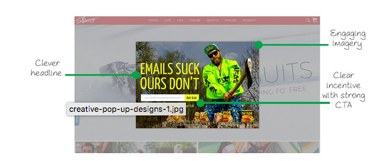
Clever Headline: Clever copy, when done right, can effectively engage a visitor, draw some laughs, and spur action. The headline “emails suck, ours don’t” resonates with online shoppers, and with this simple association, shoppers are more likely to subscribe.
Relevant and Fun Imagery: Does anyone still eat spam? Rhetorical question. All jokes aside, this image is awesome. It aligns with the popup copy, shows off some Shinesty Apparel, and shows a dislike for spam emails. Again, siding with the shopper. This isn’t the first time we’ve highlighted Shinesty Apparel’s design sense; check out this post where we highlight their Shopify Plus store design.
Incentive and CTA: Shinesty uses a simple $10 off of orders over $30, which is a mutually beneficial offer. Shoppers get a discount, and Shinesty has a consistent dollar amount discount, so they know exactly what they are giving away (as opposed to a percentage off).
The CTA “Get $10” is incredibly engaging and makes the shopper want to submit their email.
4. Email Pop-Up by Wee Squeak
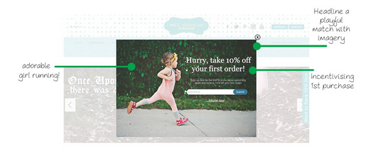
Adorable Photo: This pop up shows off a cute lifestyle photo of a little girl running in her Wee Squeak shoes. This image also acts as a visual cue, with the girl running towards the copy. This causes your eyes to subconsciously move directly to where the girl is facing.
Actionable Headline: A clear headline will relay your message most effectively. Wee Squeak takes it a bit further by adding some urgency. The simple addition of “Hurry” can cause a shopper to take action. Another option to induce urgency is to use a countdown timer on the promotion.
First Purchase Incentive: Getting shoppers to purchase from you for the first time is no easy task. To make this easier, Wee Squeak offers first-time shoppers an incentive of 10% off their order. This is a no-brainer promotion to run for first-time visitors.
5. Contest Pop-Up by Tower Paddle Boards
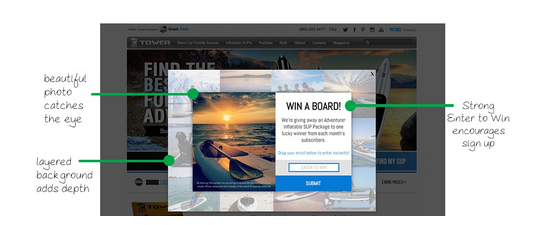
Product/Lifestyle Photography: Anytime you can showcase your products in beautiful photography to shoppers, it’s always a good idea. This photo from Tower Paddle Boards grabs attention and is perfect for their promotion.
Big Ticket Item Incentive: Tower not only chose a big ticket item for their contest but also an item that is attractive to their ideal customer. This way, they know they are capturing emails from people who are interested in their products. Big ticket items drive tons of email sign-ups!
Layered Imagery: I haven’t seen many popup designs with layered background imagery, but it really adds an attractive element to this pop-up. This design choice looks great on their site and fits nicely with their branding.
6. Discount Promotion by UProtein
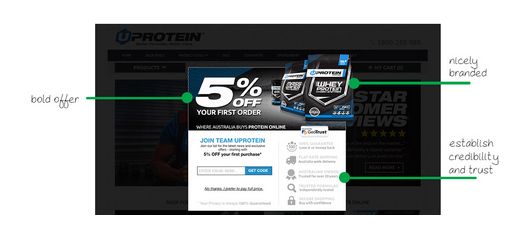
Bold Offer: There’s no missing what this pop up is offering. While 5% may seem like a small discount, every little bit matters. Also, as a business, you need to use promotions that make sense with your margins. Discounts are always a great incentive to drive email sign-ups and can also prevent shoppers from coupon and price hunting off of your site.
Nice Branding: This email pop-up fits the website design perfectly and looks like it took some significant time to develop (but it didn’t).
Badges: Credibility and trust are critical for any successful e-commerce business. UProtein showcases its guarantee, shipping cost, 20 years in business, and secure shopping. These badges are a great thing to put right in front of shoppers with an email pop-up.
7. Free Shipping Promotion by Beloved Shirts
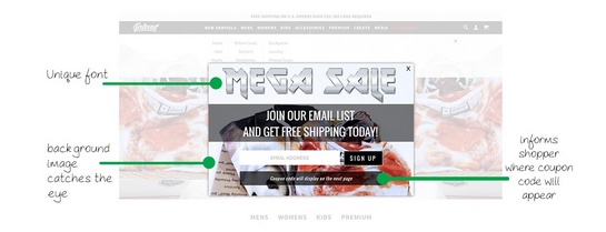
Unique Font: Beloved Shirts always likes to have some fun with their pop-ups. This is no exception. The “Mega Sale” is tough to miss and fun. I’m drawn in, that’s for sure.
Simple Copy: While the headline is fun, the copy is informative on what action needs to be taken and what value will be received. Free shipping is also an incredible sales driver!
Coupon Code Within Pop-Up: Letting your shoppers know that the coupon code will appear inside of the pop up makes it easier for the shopper. They can immediately receive the benefit without having to wait for an email, and as a retailer, anytime you can keep a shopper on your site, that’s a positive.
8. Exit Prevention Pop-Up by US Patriot Tactical
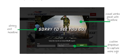
Personalized Exit Headline: Since this is an exit offer, this only shows to visitors who are about to leave your site. By using a unique headline to cater to leaving visitors, you’re more likely to grab their attention and get them to take action.
Perfect Exit Visual: U.S. Patriot Tactical picked the perfect image for an exit offer. As a leaving visitor, it’s pretty hard not to interact with this pop-up.
Capturing More Info: While using a single field opt-in form is the easiest for visitors to submit, there are benefits to using multiple field forms. This is a perfect example of additional fields that are relevant. It’s only one additional field and asks for “Area of Service,” and this zero-party data will result in more targeted emails for subscribers.
9. Gated Content Pop-Up by Momentum Mag
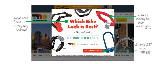
Asking a Question: Momentum Mag engages traffic with a popular question that many are interested in the answer to. They immediately provide an incentive with a free downloadable guide. This is a perfect example of how to use gated content to drive email sign-ups.
Associated Imagery: Bike owners most likely own one or two types of bike locks displayed. This imagery pulls them in by association and drives engagement.
Strong CTA: Copy on a CTA always needs to be tested… but this copy is damn near perfect. It spurs action and uses two words that are known for driving website conversions: “Get” and “Free.”
10. Email Capture Pop-Up by Packed Party
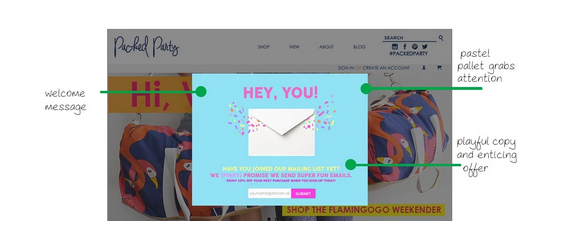
Welcome Message: It’s important to recognize that you are actively engaging visitors on your site. Packed Party keeps it simple with a bold welcome message.
Pastel Grabs Attention: I spoke about using unique color schemes earlier in the article. While this doesn’t match their website color scheme, it still aligns with their brand and also grabs attention, which is key for email pop-ups.
Playful Copy: It’s always nice to show some personality and set some expectations for your email newsletter at the same time. I love this copy that Packed Party went with. The only thing I’d change would be to make the 10% off a bit larger. It may grab some more attention.
11. Spin-To-Win Pop-Up by Pura Vida
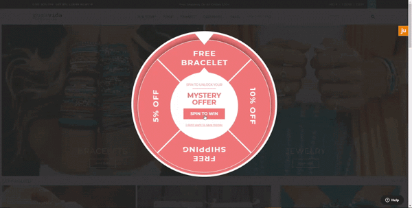
Gamification: Spin-to-win pop-ups are a popular choice for lead capture, and this simple four-option wheel was pioneered by Pura Vida’s design below.
Simplicity: The four potential prizes are clear to any website visitor looking to opt in, making their chances of winning the desired prize even higher.
FOMO: The “mystery offer” copy incentivizes potential subscribers by piquing their curiosity and making them feel like they might miss out if they don’t try their luck!
12. Exit Pop-Up by Cocofloss
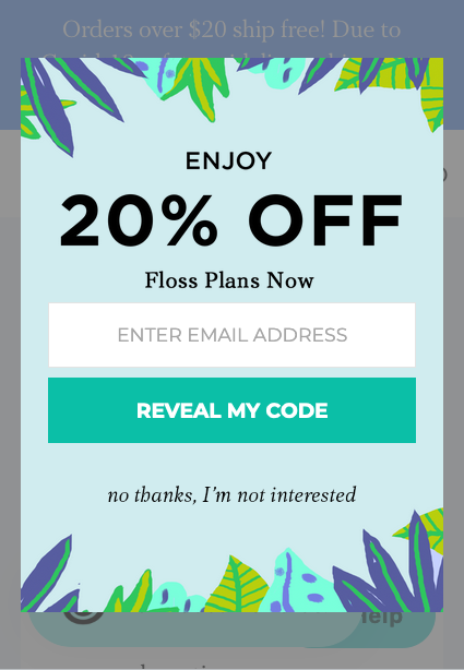
Tropical: The bright tropical visuals give this exit offer a bit of pizazz that fits nicely within Cocofloss’s branding.
Exit Trigger: Unlike most lead captures which are for new visitors or based on interest, this is an exit offer designed to fire when someone goes to leave the Cocofloss site. While we usually don’t recommend using exit offers to collect leads, it’s a strategy that’s worked for them!
Cocofloss used a full-funnel marketing strategy to drive a 28.6% conversion rate from promotions and reduced their overall cart abandonment rate by 20%; learn more in their case study.
13. Email + Zip Code Pop-Up by Snow Monkey
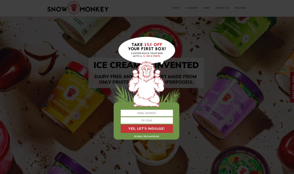
Multiple Fields: Snow Monkey is a vegan ice cream retailer that wanted to geo-target their email marketing campaigns to maximize regional sales. By collecting email addresses alongside zip codes, Snow Monkey could send out emails based on which grocery stores their products were coming to next and let subscribers know where they could pick up a pint near them. Check out how this email pop-up strategy led to 500% email list growth in their case study.
Creative Shape: Most pop-ups are standard shapes (rectangles, squares, etc.) which is fine, but if your branding allows you to go outside the box…you should! These stand out more to visitors and make the onsite experience more memorable.
14. Email Pop-Up by Redline Steel
Simple is best: Sometimes, bright colors and shapes don’t mesh with your website’s branding, and that’s fine. Pop-ups can be just as effective when they’re kept simple; just look at Redline Steel, who collected over 80,000 subscribers in just one month with a minimalist design.
Motion: The pulsing call-to-action (CTA) to submit their email immediately draws a visitor’s eye to what you want them to do while a carousel of popular designs rotates through on the left. This shows new visitors the types of products they can expect to purchase and shows a variety of styles, perfect to drive opt-ins.
15. Email Pop-Up by Ella + Mila
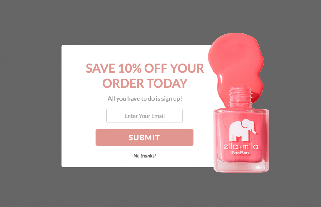
Product Imagery: Ella + Mila uses a lot of their products in their pop-ups, which as a beauty/cosmetics brand, makes sense since their packaging is a big part of the brand experience. This helps their pop-up design stand out and gives visitors a close-up view of their products.
Shape: While the lead capture is mostly rectangular, the nail polish is pouring off the edges, giving it that extra “oomph” element. Combined with the bright pink color, it stands out from the website and makes you take a beat to decide about opting-in.
Check out their case study and how these email pop-ups were able to add around 9,000 subscribers per month to their database.
17. Spin-To-Win by Bryan Anthonys
Gamification: This is the more “standard” design for spin-to-wins, with lots of potential prizes to win. Gamification adds a psychological element to lead captures, making it fun for the website visitor since they’re winning something, and drives opt-in rates to an average of 13%.
Color: The black and gold design is a contrast to the rest of Bryan Anthonys site, which is mostly softer colors but still meshes nicely. This color choice makes the pop-up a striking contrast to the rest of the screen and feels elevated. Check out the Bryan Anthonys case study and see how using a combination of email pop-ups, they were able to increase revenue by 300%
18. Email Capture Pop-Up by HYLETE
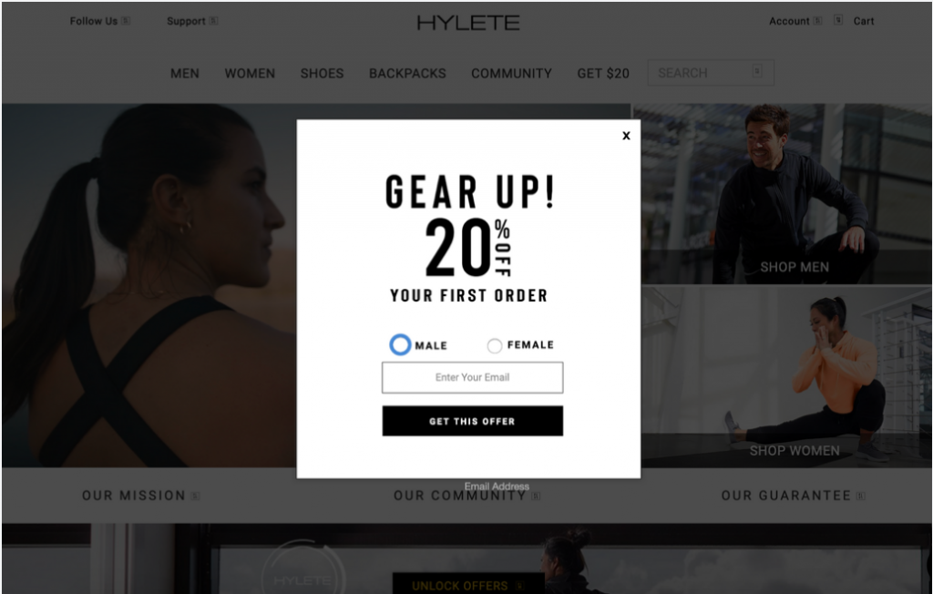
Clean Lines: Another great example of how simple branding is sometimes best on welcome pop-ups. HYLETE is a fitness apparel brand whose focus is on its community and products, not frills. This is reflected in the design and shows new visitors exactly what they can expect from HYLETE from the start. Plus, they segment their email pop-ups based on traffic source, so their opt-in attribution is on point.
Collect more information: Asking subscribers to click male or female when they sign up helps HYLETE better segment email content and messaging down the line so they know what products this subscriber is interested in. Check out their case study to see how HYLETE increased their AOV by 8% using Justuno’s pop-ups.
19. New Visitor Pop-Up by Regina Romero
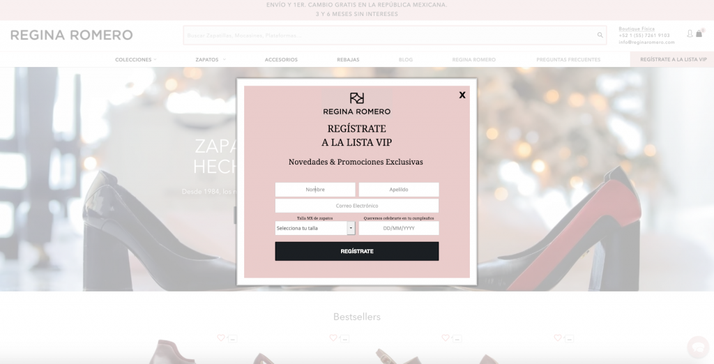
Multiple Fields: Regina Romero not only collects contact information in their email pop-ups but also shoe size and birthday. These are both great pieces of zero-party data to better tailor their email marketing to these subscribers later on and create more in-depth customer profiles.
20. Free Gift Email Pop-Up by ZALA
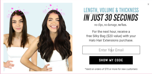
Limited Time Copy: ZALA urged their new subscribers to use their offer within the next hour or risk losing out. This urgency not only drives same-session conversions but also creates FOMO on a free gift for new customers.
Product & AOV Specific Offer: ZALA’s email pop-up has specifications on which product is purchased and a minimum order value to be eligible for the promotion. Both of these are great ways to protect your bottom line, and the incentive is tailored to each product.
Imagery + Headline: ZALA’s choice of a before and after comparison with their product is a great way to emphasize their headline and show visitors it really is that easy!
21. Email + SMS Capture Pop-Up by DripDrop
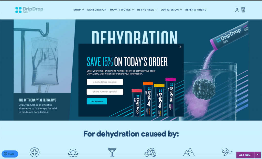
Email + SMS: DripDrop is a truly omnichannel marketing operation, and their commitment to that is reflected in their new visitor promotion. By collecting email addresses with an optional phone number field, they can be sure to contact subscribers on their preferred channel.
22. Custom Spin-To-Win by Simply Carbon Fiber
Custom Design: Custom-built spin-to-wins are one of our favorite types of email pop-ups. They combine the power of gamification with a completely unique design that shows off a brand’s core. Simply Carbon Fiber had a spin to win built into one of their best-selling products, combining a unique shape and educating visitors on their products immediately.
23. Custom Gamification by Keto-Mojo
Custom Gamification: Another great example of custom design work here it’s a “spin” of the numbers inside a meter instead of a wheel. This is a great take on the wheel function and showcases their product front and center in their new visitor email pop-up!
24. Custom Spin-To-Win by Chelsea’s Gifts
Custom Design: Spin-to-win plus product imagery, a great showcase of Chelsea’s Gifts branding and items combined with the gamification aspect! This email pop-up is perfectly on brand and a great first experience for new visitors to their website.
25. Exit Offer Pop-Up by Eczema Honey
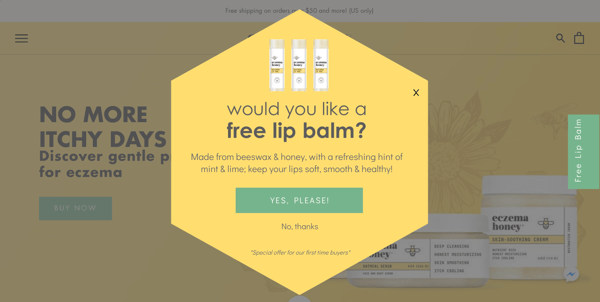
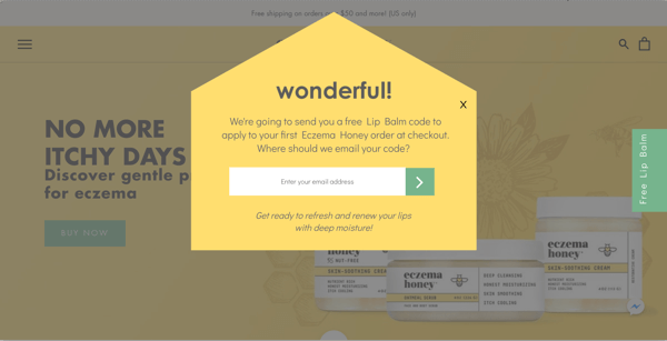
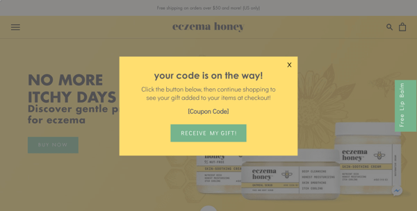
Exit offer: Eczema Honey’s pop-up is timed to fire when a visitor goes to leave the site; as we mentioned above, we don’t typically encourage exit pop-ups to be your main source of leads, but in this case, it works! This email pop-up strategy made visitors an offer they couldn’t refuse and drove a 14% opt-in rate and 34% conversion rate for desktop visitors!
Free Gift: This can help new visitors who have never experienced your product get more excited about an offer than simply 10% off. This is especially a powerful motivator as an exit offer since it’s giving visitors ownership of something they would be leaving behind if they don’t convert!
Multi-Step Pop-Up: You can see that Eczema Honey has three steps in this email pop-up. The first is a value on the introduction screen (free lip balm); the request for email is on the second; then, on the final screen, you drive home the conversion by adding the free lip balm automatically to their cart (never having to click off your site or check their inbox).
26. Email Capture Pop-Up by Cocokind
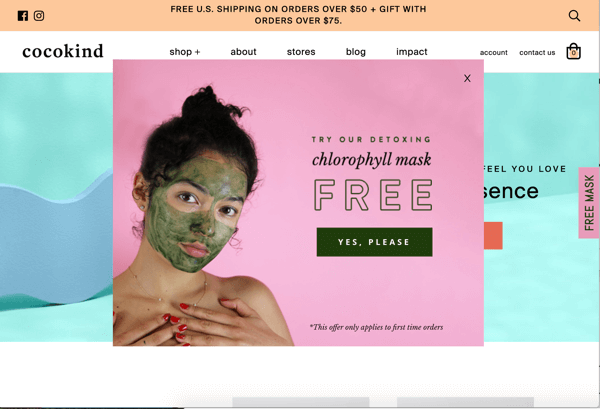
Relevant Offer: Percent discounts are the norm for most lead capture pop-ups, and while those are great (they work for a reason!), sometimes other non-discount incentives can be more appealing. Cocokind offered a free gift in exchange for their email address, which works perfectly for their audience and augments their first purchase experience with something extra.
Multi-Step: The CTA here says “yes, please” to claim their offer, which will open the next screen where they can input their information. These introduction and engagement screens create a layer of interaction for the website visitor, which makes them more likely to follow through with subscribing.
27. Full-Screen Pop-Up by Florence by Mills
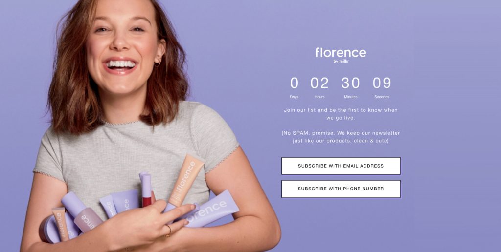
Full Screen: Florence by Mills used a full-screen pop-up to act as a landing page to collect information for a brand launch. This is a great example of how to use pop-ups in a different way to create an entire onsite experience.
CTA Options: Two CTAs on this full-screen pop-up allow the visitor to choose their preferred channel, either email or SMS. This is a great way to ensure you’re meeting customers where they want and not wasting time on channels that won’t convert your audience.
Timer: The countdown at the top of the pop-up shows you how long until Florence by Mills goes live. This helps drive exclusivity and urgency since subscribers can be the first to know when it’s available by opting in–a great drop/launch strategy!
28. Email Capture Pop-Up by Huk
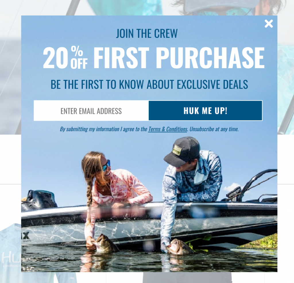
CTA Copy: Fun, playful copy is one of the best ways to create compelling CTAs, and this is a great example. Huk gets to show off some brand personality and appeal directly to its target audience.
Lifestyle Photography: We’ve showcased a lot of product imagery in the examples above, but lifestyle photography is great as well. Depending on your branding, these images can resonate well with visitors and be more engaging to them than simply products/packaging. For example, fishermen out in a boat vs. fishing line in a box for sporting goods brands!
29. Mystery Prize Pop-Up by Diff
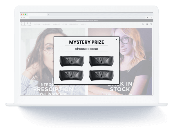
Mystery Prize: Another form of gamification is the mystery prize, where visitors can click on any of the elements to “reveal” their prize. This is another way to engage visitors and add a bit of fun to the lead capture process on your pop-up.
30. Email Capture Pop-Up by Black Buffalo
Animation: The subtle animation of a buffalo breathing helps to create a compelling design element for this email pop-up. By combining interesting visuals with a prominent headline, Black Buffalo guarantees visitors will stop and take note.
Minimal Information: Black Buffalo only required two pieces of information, which helps guide visitors through the signup process quickly. Ease of use is the number one thing to remember when designing lead capture pop-ups; make sure you’re not creating more work for your visitors!
31. Email Opt-In Pop-Up by Blue Lizard Sunscreen
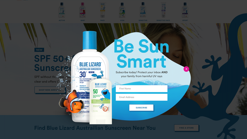
Familiarity: Blue Lizard Sunscreen used a well-known Sesame Street character in their product placement to showcase their marketing partnership. This helps generate increased trust and capture the attention of new visitors who may not know much about their brand.
Fun Shape: The product imagery, along with the non-traditional shape, helps this pop-up stand out even more. The tropical wave vibe is perfectly suited for the product/branding and helps it jump right off the page.
32. Email Pop-Up by Pool Factory
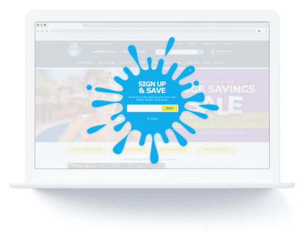
Fun Shape: Adding a fun shape to an otherwise simple pop-up can be all you need to take your promotions to the next level. This water “splat” is a fun take on their industry and helps Pool Factory stand out.
33. Contest Pop-Up by evo
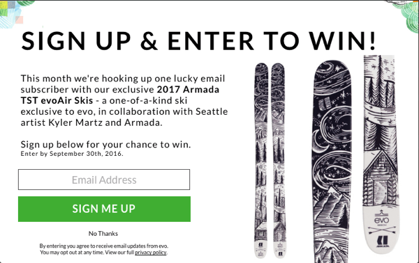
Giveaway/Contest: If you don’t want to offer discounts and are looking for an alternative offer, try contests or giveaways. Here evo is offering entries to a giveaway for one of their top-line products in exchange for email sign-ups. This option is ideal for those with high-price items or no room for discounts on orders.
34. Product Launch Pop-Up by Nuheara
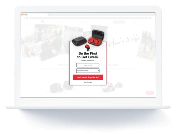
Product Launch: This email capture is designed to specifically collect leads for a new set of ear pods launching at early bird pricing. By offering first dibs on a new product at an exclusive price, Nuheara can be sure they’re collecting high-intent leads with this email pop-up design.
35. Spin-To-Win by Rover
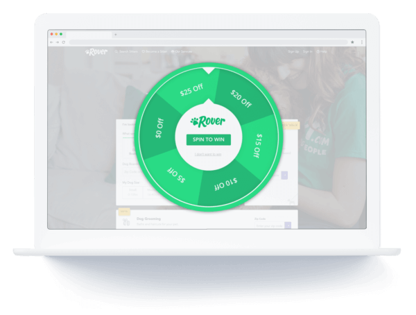
Spin-to-Win: Another example of the simplified spin-to-win wheel by Rover, fewer choices make this pop-up visually appealing and not overwhelming. Plus, fewer choices mean a higher likelihood of winning the offer they want, and that drives more opt-ins.
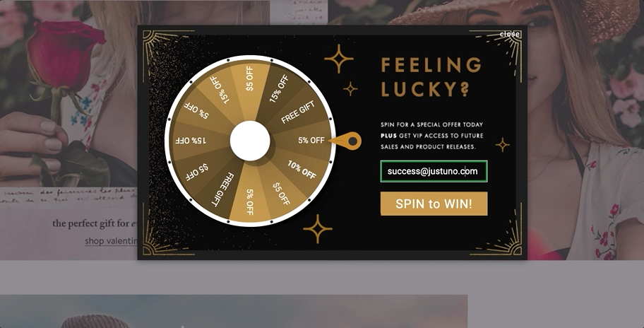
36. Slot Machine Pop-Up by Sand Cloud
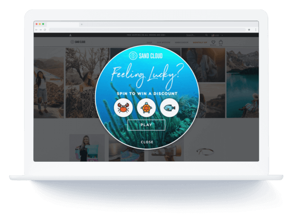
Slot Machine Gamification: This custom design combines a different type of gamified promotion, the slot machine, with Sand Cloud’s ocean visuals for an on-brand experience.
Playful copy: The headline “Feeling Lucky?” immediately makes shoppers want to try and win. Challenging them to engage with the pop-up gives visitors a sense of ownership over the offer and increases FOMO for opting in.
37. Corner Email Pop-Up by Roma
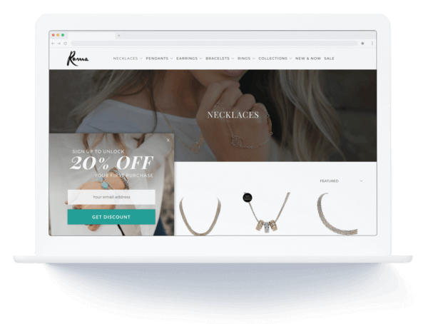
Corner Placement: Most of the examples above are center or full-screen pop-ups, but the bottom corners are effective locations as well. These are less interruptive and don’t require the visitors to engage with the pop-up to continue browsing your site.
38. Cinco de Mayo Animated Pre-Built
Animation: This pop-up has animation going on all layers; it’s an eye-popping design with lots of bright elements and fun. Simple animations like pulsing CTAs or headlines can help your pop-up stand out and take a relatively simple design to the next level.
Holiday: As a Cinco de Mayo-specific promotion, this lead capture gives you more room to get creative and incorporate otherwise non-matching elements into the design of the pop-up. Justuno customers can access hundreds of pre-built pop-ups like this one for holidays and seasonal events throughout the year, so you never miss out on a sale.
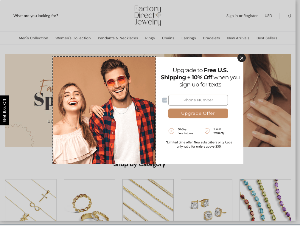
39. Two-Step Lead Capture By Factory Direct Jewelry
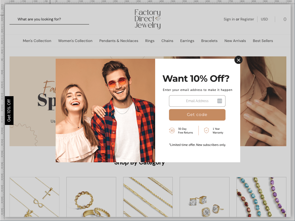
Incentive + Trust Builders: This pop-up has a discount for new customers plus references to Factory Direct Jewelry’s return policy & warranty. Both of these help build trust with first-time visitors and make them more confident in a purchase.
Two-Step Lead Capture: This email pop-up is a two-step lead capture with an SMS opt-in on the second screen. Factory Direct Jewelry uses a tiered offer with an additional incentive of free shipping + the original 10% off. If new visitors aren’t quite ready to say yes to SMS yet, they can close the pop-up, and the tab (seen on the left side of the screen) will be waiting for them if they change their mind after browsing a bit longer.
Design Your Own Email Pop-Ups
Pop-up design isn’t rocket science, but there are definitely a few aspects to be aware of. These email pop-up designs above are great examples, and we encourage you to draw inspiration from them when creating your own. Get started with the Justuno design canvas today on a free 14-day trial!
Want to work with an agency instead? Check out these 10 inspirational Shopify Plus store designs from design agencies to see where your site can go.