How many hours did you spend last year trying to increase conversions on your store? If you’re a smaller store, that number might not be overwhelming, but most retailers are at least thinking about it on a daily basis. Increasing the efficiency of everything from your ad campaigns to your final checkout steps is complicated, and often painful.
Testing tiny changes (like button color) can be frustrating, and these “optimizations” don’t often amount to much more than a single percentage point increase or decrease. And much of that ends up washing out anyway, so is all that effort really worth it?
The good news
Most of us can’t afford to spend much time or money worrying about these things, but we’ve got great news. One of the most underutilized strategies in e-commerce can increase overall conversion rates by double digits (yes, really) with only a couple hours of design work.
Earlier this year, we spent dozens of hours analyzing data from hundreds of e-commerce retailers to see if we could learn how to squeeze more out of the search area, and we were startled by how drastically a few seemingly minor changes affected search conversions (conversions by visitors using search on a retail website). Now we’re going to share those findings with you.
After looking at our initial set of data, we asked one of our clients to make a few minor changes to their search bar in order to confirm that our data showed what we thought it did. The goal was to increase the number of visitors using search since those visitors convert at a rate that’s 350% higher than normal. After making just 3 minor changes, their search usage more than doubled from 6% to 13%. And those new search users were converting at a much higher rate.
Before
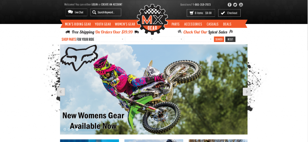
After
What changes did we suggest?
1) Search bar placement
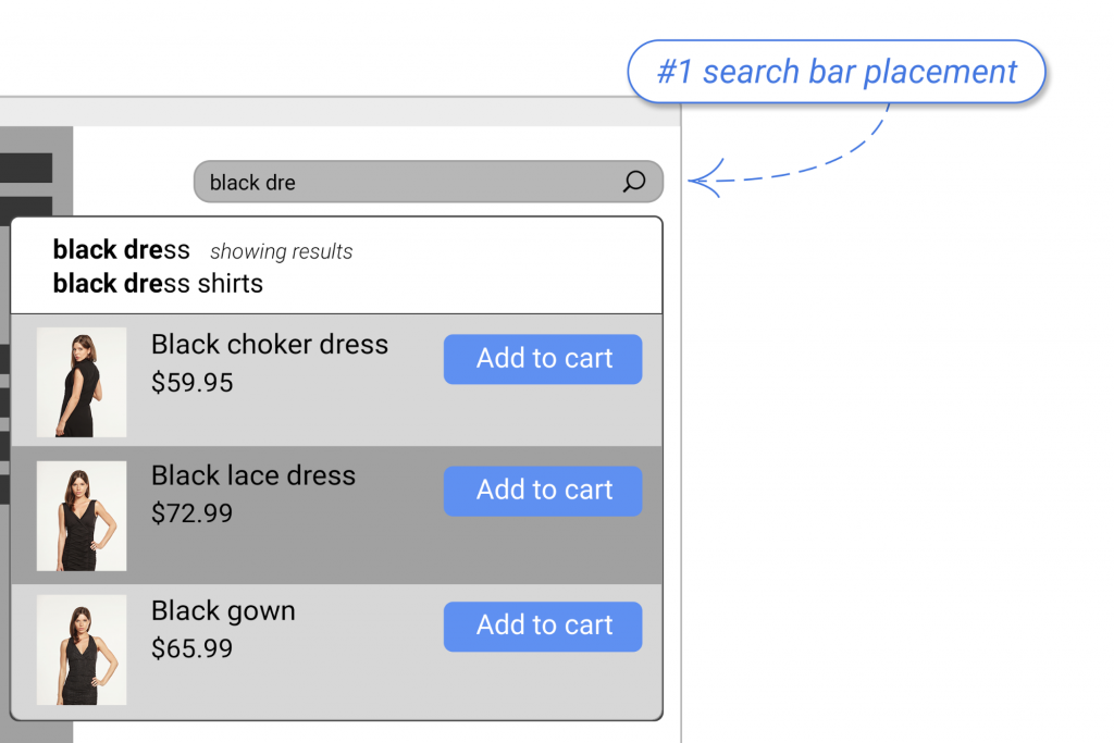
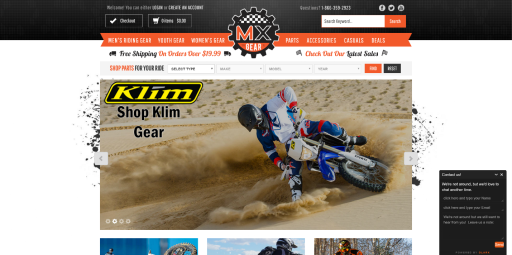
The first change we suggested was to relocate the search bar to the right side of the header. Our research showed that MXGear’s current placement (top left) was the location that received the least engagement from visitors.
According to our research:
“Center placement resulted in 15.86% search usage, whereas top right delivered 13.43%. Top left was, by far, the worst option with just 7.72% usage.”
Even though the center underneath the header might have had higher usage, this would have required a resource-intensive design rework of the home page. We wanted to keep the changes to a minimum to make it as simple as possible to maximize the ROI of their time.
The additional 2% that they might have gotten from such a rework probably wouldn’t have been worth all that time. However, this is something every retailer might consider if they’re going to be redesigning their homepage anyway.
2) Input field background color
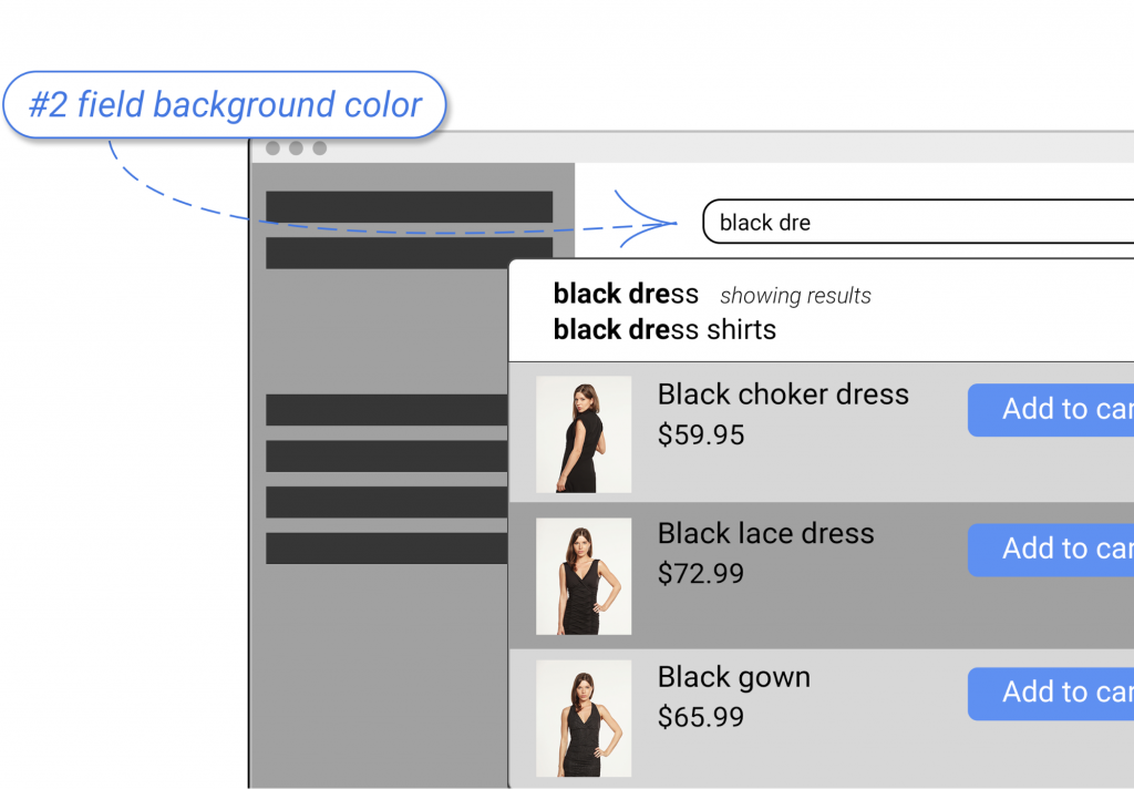
We were very surprised to find out just how important the background color of the input field actually is. We suspected white might be the best color, but were blown away by how wide the margin was between white and every other color.
From our extensive report:
“Sites with entry fields that were any other color saw usage of 4.79%, while sites that used a white text entry field (even on a white background) saw usage of 14.57%.”
Just changing from black, grey, or whatever the site’s accent color is can obviously have dramatic effects. Our belief is that white is seen as a sign that the field is open for text entry. On many sites and applications, a “greyed out” field is blocked. This seems to apply to other colors as well.
With MXGear, they used the site’s background color (black) for a more minimalist look. But clearly, this was making users confused as it not only blended in with other buttons but might also have convinced users that entry was unavailable for some reason.
3) Increase search area contrast
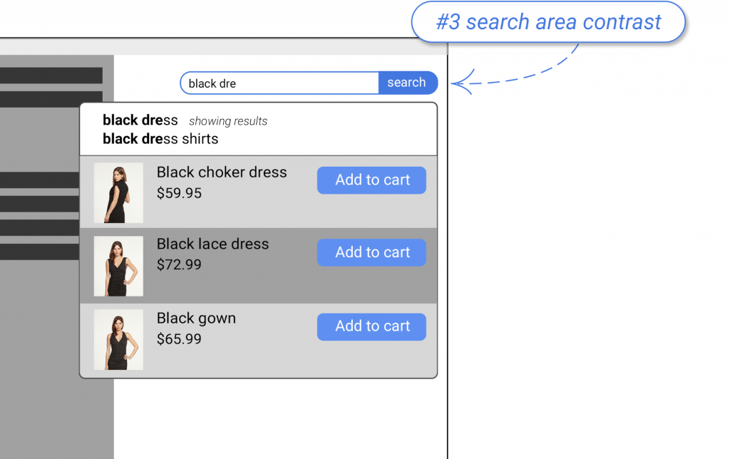
Lastly, we asked MXGear to increase the contrast of the entire search area. Partly, this was accomplished by using the white text entry background since the rest of the site is black.
In addition to this, we asked them to include a search button and border that used the site’s accent color.
In our full report, we found:
“Whereas low contrast search bars led to 8.78% search usage, those with high contrast colors and borders generated 18.82% search usage.”
They also included the word “search” in the button, but this will have only a negligible effect on usage. Ultimately, it’s hard to argue that these changes didn’t make the search feature much easier to locate.
Conclusion: Don’t ignore search
While the changes to this site were minor from a technical standpoint, the difference is obvious. Perhaps your site’s search area is already fairly visible, but making changes to increase its visibility will have an effect on usage. There are many more optimizations that can be made to increase usage and even some technical best practices which can make search more relevant. In fact, there is so much to talk about, we wrote an entire book about it.
Do not ignore search. Optimizations can make it much easier for shoppers to use your site, improving the user experience which leads to more engagement and a better bottom line.